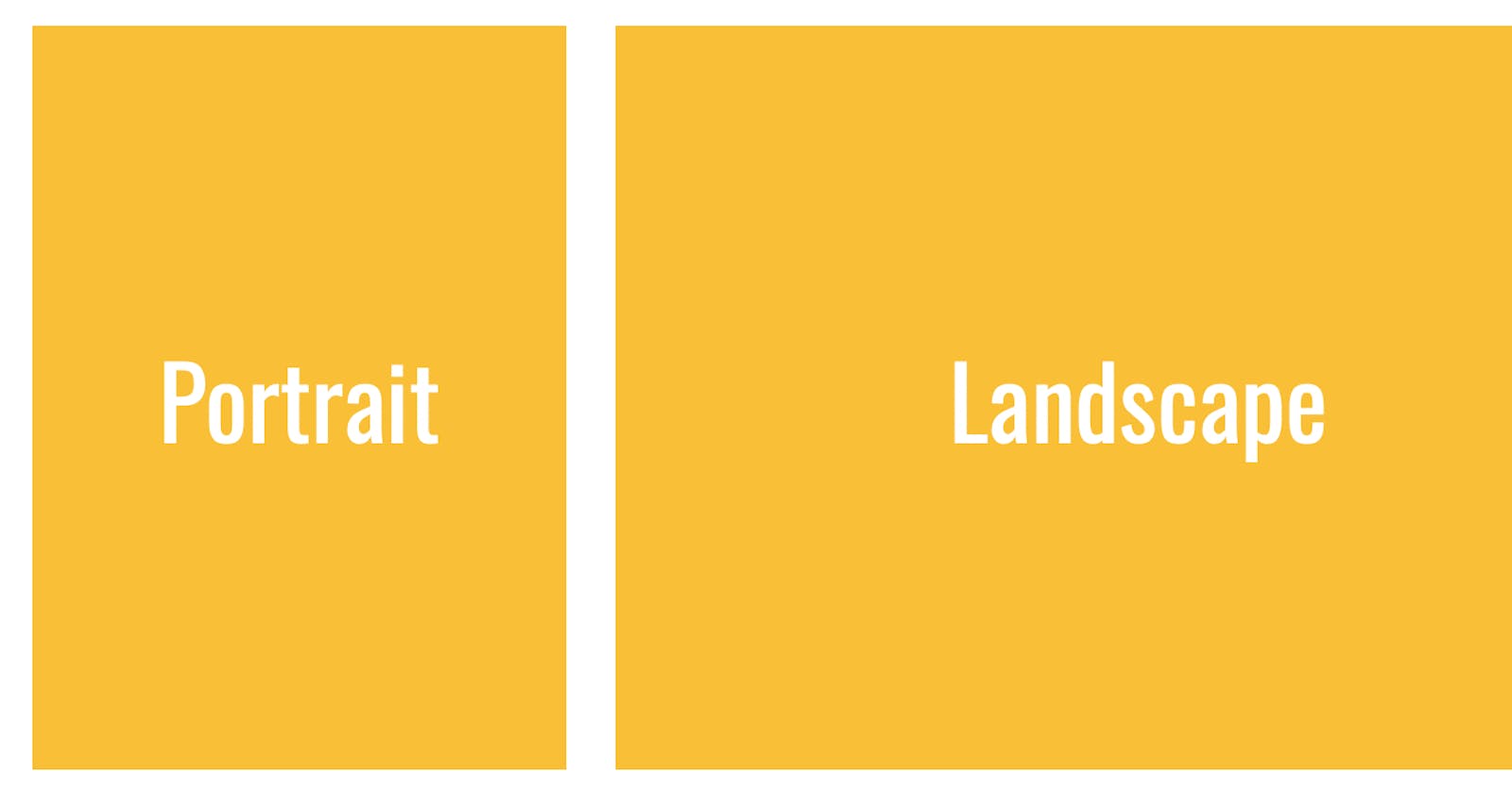
Changing styles on a webpage according to the orientation ( landscape or portrait )
In CSS there are a lot of media queries properties that gives us flexibility of changing the way out webpage looks on different screen sizes, different platforms etc. But there is a very simple media query in CSS that can help you if you want to styles the page according the orientation of users device. Whether the user is in landscape ( width > height) or portrait (height > width).
It is called orientation (with o small)
for example have a look at the small piece of code below.
 <article>
        <h1>Main Heading</h1>
        <p>Lorem ipsum dolor, sit amet consectetur adipisicing elit. Odio, iste praesentium? Ipsa nisi adipisci placeat quidem impedit quam fugit eos eaque. Dignissimos est qui porro deleniti hic numquam dolores! Blanditiis! Lorem ipsum dolor sit amet consectetur adipisicing elit. Quae incidunt beatae dolores asperiores nihil totam? Accusamus totam corporis illum eaque modi, obcaecati maxime iusto molestiae suscipit veritatis, repellat odio perferendis.</p>
</article>
Now lets give some styles to the code
<style>
article h1
{
    color: red;
}
article
{
    padding: 20px;
    gap: 10px;
    display: flex;
}
</style>
As you can see we have given article, a display property of
display: flex
Now what we will do is, make use of some media query properties
@media (orientation: landscape)
{
    article
    {
        flex-direction: column;
    }
}
@media (orientation: portrait)
{
    article
    {
        flex-direction: row;
    }
}
After we apply these properties, what the browser will do is it will check the width and height of the window whenever height goes less that width it will show the landscape properties and vice versa.
This method can come very handy when designing navbars e.g., May be you want to show a side navbar bar on large screens (landscape) and a simple top navbar in portrait mode.
I have just showed one property that is of
display: flex;
You can use it to show or change anything you want (color, font-size, font-weight etc. etc. ) with the orientation property in media-queries
